Tuesday, August 24, 2010
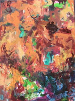
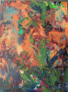
it's not over yet
It's getting there, but it doesn't seem to have the energy and freshness that I want. I guess that means I need to splash and slash and scratch on a few more strokes. But it's getting there.
Saturday, August 7, 2010
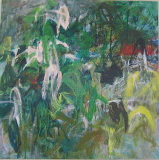
just when I thought I was out, they pull me back in...
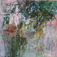
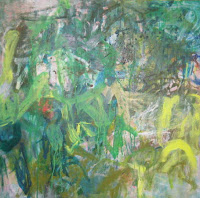
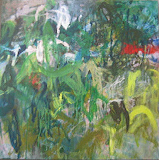
I was liking the direction the painting was going, with a lot of toned down and "whited out"areas. Much calmer than any of my previous works in progress.
But when I brought it to class, the reaction was decidedly underwhelmed. I couldn't really justify the reason for the change in energy and style (?) --other than I don't yet have one.
So, maybe my painting moods are bi-polar. All I know is that I liked the control I felt with the "whited out" painting. So, for no reason, other than peer pressure, I went back to the "wild" style. But perhaps a breakthrough - I am actually spending more time looking, and then applying strokes strategically. A few more scribbles, some yellow, some brown, more white and a big red line. Hopefully, the strokes haven't lost the wild and aggressive energy.
Thursday, July 29, 2010
Monday, July 26, 2010
more on painting
Maybe it's redundant to keep posting the same "before" photos of the paintings at each stage. But it helps me to see them all together and see how a few brush strokes can make a big change. DUH. I guess it also reinforces the helpful mantra "it's only paint."

Here is the original "Half Moon Bay Landscape" that I started in January this year! It was just too busy and I gave up on it.
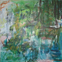
Here it is at the "very green" after a few washes of greens.
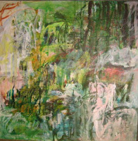
It's now end of July and I'm seeing how it can be good to put away a painting and go back to it at a later date!
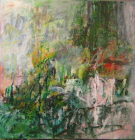
still in progress...

Here is the original "Half Moon Bay Landscape" that I started in January this year! It was just too busy and I gave up on it.

Here it is at the "very green" after a few washes of greens.

It's now end of July and I'm seeing how it can be good to put away a painting and go back to it at a later date!

still in progress...
Thursday, July 22, 2010
acrylic again
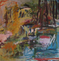 For tonight's painting class, I decided to go back to acrylics, since the oils are too difficult to transport while wet.
 I decided to paint over an old canvas, the failed Half Moon Bay landscape that became too busy with many colors (shown at left.) I sanded down the rough spots.
Since it was supposed to be a landscape, I figured I'd stick to that idea. I mixed 3 washes of greens (a teal, an olive and an emerald green) and started to cover the old canvas. Then I added some "white" spots (thinned out white so it wouldn't be completely opaque.)

I'm trying to remember the process from the first class I took from Shilo. Thin washes in different shades of the same color, followed by gradually thicker washes in a harmonizing color. It is useful for me to try to replicate that process, since I tend to forget if I don't do it often enough. I think it was a bit of a mistake to switch to oils for the private lessons because I hadn't quite assimilated this process for the acrylic. But, I suppose I just need to do more of BOTH. "Mileage" as Shilo says.
So the painting is looking pretty green right now. The next step will be to go a little less watered down--maybe bring in the colors that are in the under-painting. I hope I don't completely obliterate the under-painting.
much too purple
The beets painting was way too busy, so I carefully mixed what I thought was a very neutral grayish purple and splashed a good deal of it to "unify" the painting. I even tested the color to match a spot on the painting. Well, it certainly looked different than I expected. Way too purple and way too much of it.
 So I mixed a lighter and more muted brownish gray purple and then dripped on some off-white. Kind of "broke the rules" by going with very thinned down paint over very "fat" paint.

I'm not sure what I'm feeling about this painting...but I'm still not happy with it.
 So I mixed a lighter and more muted brownish gray purple and then dripped on some off-white. Kind of "broke the rules" by going with very thinned down paint over very "fat" paint.
I'm not sure what I'm feeling about this painting...but I'm still not happy with it.
Friday, July 16, 2010
back to the drawing board
I took the whole month of June off from painting. Mom came to visit for RC's graduation and RF's wedding. Then I had to pack up the studio in preparation for house guests for the wedding.
So it feels weird to start painting again. Signed up for Shilo's class at the Art League. I'm continuing to work on the paintings from the private lessons. It feels like I'm starting over, after such a long break--back to the drawing board, so to speak.
It's been good to get Shilo's feedback. Otherwise, I think I'd be quite lost and discouraged...I have to say I wasn't too happy looking at my paintings. Only one is looking almost finished to me. The rest are starting to look overworked and tight.


Monday, May 24, 2010
week 5 - off the leash
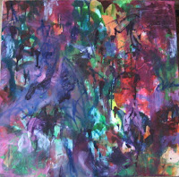
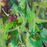 "Maple Tree" looks completely different from the previous week. It had been mostly burgundy and violet. At class I put in broad strokes of "lights" in different shades of green with a lot of guidance from Shilo. It didn't feel intuitive at all, painting over all that other brushwork I had already done. But Shilo said "you'll see" and that I should step away from it for a while. She said to go home and put in the darks, using different brush size, brush stroke, etc. I think I went a little overboard--it's looking a bit busy, although it does look reminiscent of my Japanese maple...
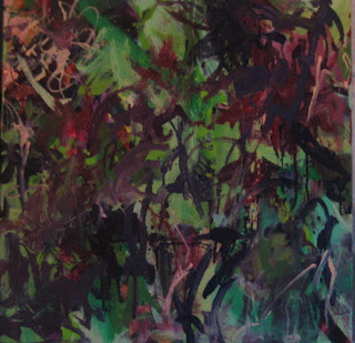
I went home and painted the "lights" on "Red Chard". Again, it didn't feel intuitive. I emailed Shilo in a panic and she emailed back saying "Take a deep breath." Ahhhh.
I will add my little scribbles in greens for the "leaves" and put in some red slashes for the "stalks". We shall see.

Monday, May 17, 2010
Thursday, May 13, 2010
week 4 - guidance is good
What a difference a class makes. Those 3 paintings I worked on at home and wasn't too happy about...I worked on today at Shilo's studio and they look SO different and IMPROVED. I'm getting there. That's the good news. The bad news is that I don't think I could have done it without Shilo's help and suggestions. She says that comes with mileage. I hope so. Anyway, I always feel pretty good after class, like I'm making progress and learning something.
I'm finally understanding what Shilo said last fall about "push and pull" regarding the darks and lights from the overlapping layers. I got to use my Oil Sticks and that was kind of interesting. I recognized that I need a wider brush. Also, Shilo keeps reminding me to let go of the fear and go wild. That DOES seem to help!

For "Foxglove" which I was worried was getting too representational, Shilo had me turn it sideways and work on the floor (as opposed to on the easel.) That helped a lot. It's looking better. Almost there. Needs some light silvery and blue greens.

And I was not happy that the 3 paintings were looking quite alike, palette-wise. Well, "Beets" certainly has taken a departure from the others. Maybe too much so. I probably need to add back the reds and violets over most of that orange. And it looks like I lost a lot of the darks. Will have to work on that too.

Didn't get to work too much on "Red Chard" but just by putting a few large strokes across the vertical "stalks" it has changed quite a bit. Also added a bigger patch of violet and lots of shades of purple. Need to put on the greens next.
I'm finally understanding what Shilo said last fall about "push and pull" regarding the darks and lights from the overlapping layers. I got to use my Oil Sticks and that was kind of interesting. I recognized that I need a wider brush. Also, Shilo keeps reminding me to let go of the fear and go wild. That DOES seem to help!

For "Foxglove" which I was worried was getting too representational, Shilo had me turn it sideways and work on the floor (as opposed to on the easel.) That helped a lot. It's looking better. Almost there. Needs some light silvery and blue greens.

And I was not happy that the 3 paintings were looking quite alike, palette-wise. Well, "Beets" certainly has taken a departure from the others. Maybe too much so. I probably need to add back the reds and violets over most of that orange. And it looks like I lost a lot of the darks. Will have to work on that too.

Didn't get to work too much on "Red Chard" but just by putting a few large strokes across the vertical "stalks" it has changed quite a bit. Also added a bigger patch of violet and lots of shades of purple. Need to put on the greens next.
Tuesday, May 11, 2010
painting at home
 I took home "Foxglove", "Beets" and "Red Chard" to work on at home after the 3rd session. I had a heck of a time when I added Titanium White for "Foxglove". Everything looked very chalky and opaque. So I scraped or wiped most of it off. I decided to try adding Liquin to make it more transparent. It was okay, but thicker, so I had to scrape off the drips. Still not quite sure how to handle the opaqueness. Maybe paint thinned out magenta over the opaque "white"? I'll have to try that after the paint dries. Also, I'm concerned that it is looking rather representational, so I need to change that.
For "Beets" I added more burgundy/brown and olive green and ochre. It's looking very dense (as opposed to "airy" and very dark. I guess the next step will be to add in lights?
 Didn't do too much to "Red Chard" and, as a result, I like it best of the three! It still has that fresh look. I only added a few long "stalky" strokes in magenta and a few dark burgundy patches. I think the next step is to add more greens.
Not too happy with these 3. They still all look kind of the same, in terms of color palette. They haven't developed into their own painting the way the other 3 have. I guess when I paint at home (without Shilo), I don't feel that "at home" painting.
Thursday, May 6, 2010
week 3 --medium value
 For our third session, Shilo had me work on one painting at a time and using thicker, but still turp/paint mixture, a little thicker than the very thin wash.
I worked on "Snapdragon", putting in the burnt orange, apricot, and peach. It is looking kind of muted because of the wet on wet. Putting in the few spots of light yellow helped it a bit. Definitely, using DIFFERENT SIZED BRUSHES is something I need to keep in mind all the time. Vary the brush size. Vary the color.
After an hour of painting and listening to my iPod, it was clear I needed to step away from the canvas and move on to the next one. (I listened to Diana Krall, which seemed right for the sultry, romantic mood I was going for.)
 Next, I worked on "Hakonechloa, Variegated Geranium and Blue Ajuga". Mostly I put in the red violets, rusty brown and a few golden tan accents. (For some reason, the picture is sideways.) For this one, I listened to the Rolling Stones, because these plants remind of tropical HEAT and a more primal energy. I am pretty happy with the big brush strokes of brown. It felt good when I did them!
 For the last hour of class I worked on "Maple tree and Iris". I was going for the purples, lilacs and violet hues. Also put in magenta and burgundy touches. It's kind of wild (Stones again.) Probably should have listened to something calmer for this one!
 The good thing is that the paintings are starting the diverge from each other, developing into distinct paintings. And, definitely, they still look nature-inspired. I'm glad that so far, I've been able to fulfill my goals for these lessons: stick to the "intent", keep it abstract, learn how to use oil paints.
Shilo says she is making me do it in stages (turp wash, darks, thicker medium values, etc.) so that I don't get overwhelmed. As I get more experience and confidence, it will be more intuitive, I guess. We shall see.
Friday, April 30, 2010
week 2--painting in the darks


For the second painting class, I selected 3 of the 6 canvases to work on. This time I had the photos printed and taped them next to each painting for palette reference. I decided to work on "Beet", "Foxglove" and "Red Chard" (for lack of better title) because they all had in common the reds and violets and I thought that would simplify my color mixing.
Shilo guided me with mixing the paint in buckets--how little paint to use vs. how much turpenoid; then split this between 2 or 3 buckets for similar color families, etc. Sounds basic, but this is all new to me, this way of abstract painting.
The day's task was to develop the paintings by putting in the darks. I mixed blue greens, olive greens, dark purple violets and red violets. I also mixed a little bit of dark brownish violet (mixed some blue green into the red violet) for the shadows of the foxglove. Here they are, after Week 2. They all kind of look the same at this point. I still am not sure what they will end up looking like, stylistically, by the last class (Week 6) but I like the abstractness so far, and they still look inspired by nature.
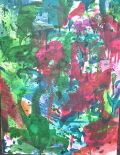 "Foxglove"
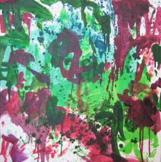 "Red Chard"
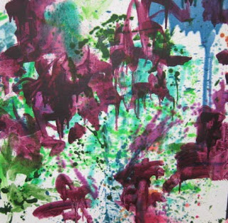 "Beets"
I took the other 3 canvases home and worked on them that night. Again, for lack of better titles, I'll refer to them as "Snapdragon", "Maple and Iris" and "Hakonechloa, geranium and blue spikes". Shilo said I should just name them "1" through "6", but for me, the plant names help me visualize color palette.
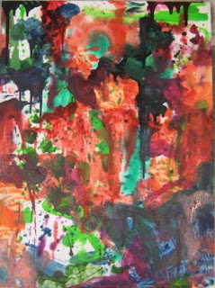
"Snapdragon"

"Maple tree w/ blue iris"
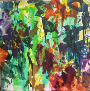
"Hakonechloa, geranium and blue spikes"
Friday, April 23, 2010
back to nature
I started private lessons with Shilo Ratner at her studio.
I brought over 6 canvases--four 24x24 and two 18x24.
We looked at the photos I took of my garden, as starting point for "inspiration" and compositional ideas. The idea is to focus on a color palette for each painting and stick to an "intent".
I mixed 3 different washes of greens and used 3 different sized brushes. Then I splattered, dripped, scraped and wiped, trying to vary the strokes as much as possible.
After some drying time, I worked on four of the canvases, leaving 2 to dry more so I could take them home to work on.
I decided that one would be inspired by the purple/violet leaves of BEETS.


The second one would be inspired by the pink/red stems of my CHARD.


The third one would have the apricot/rose colors of my SNAP DRAGON.


And the last one would be based on the purple/lilac colors or my FOXGLOVE.


Photos of the 18x24 should be vertical (use your imagination!)
For the 2 canvases that I brought home, I decided they would be inspired by my front garden plantings.
One is based on my yellow striped Hakonechloa grass, variegated geranium (chartreuse and burgundy) and Ajuga muscari (purple leaves with blue spikes)


The other is based on my wild irises (purple) and red maple.


This is Stage 1. They are looking garden-y, which is my intent, but I also want to keep them very abstract.
I brought over 6 canvases--four 24x24 and two 18x24.
We looked at the photos I took of my garden, as starting point for "inspiration" and compositional ideas. The idea is to focus on a color palette for each painting and stick to an "intent".
I mixed 3 different washes of greens and used 3 different sized brushes. Then I splattered, dripped, scraped and wiped, trying to vary the strokes as much as possible.
After some drying time, I worked on four of the canvases, leaving 2 to dry more so I could take them home to work on.
I decided that one would be inspired by the purple/violet leaves of BEETS.


The second one would be inspired by the pink/red stems of my CHARD.


The third one would have the apricot/rose colors of my SNAP DRAGON.


And the last one would be based on the purple/lilac colors or my FOXGLOVE.


Photos of the 18x24 should be vertical (use your imagination!)
For the 2 canvases that I brought home, I decided they would be inspired by my front garden plantings.
One is based on my yellow striped Hakonechloa grass, variegated geranium (chartreuse and burgundy) and Ajuga muscari (purple leaves with blue spikes)


The other is based on my wild irises (purple) and red maple.


This is Stage 1. They are looking garden-y, which is my intent, but I also want to keep them very abstract.
Subscribe to:
Comments (Atom)


